RED…
The color of love, of passion…
As the English would say, "eye-catching," which freely translated means "you can't take your eyes off it"… and that's absolutely true!
The color of Ferrari, of blooming poppies, of nail polish on a beautiful woman's hand, of ripe fruit, of a lipstick mark…
We love it because it's warm: "fire-red." Because it's vibrant, full of life. We love it because it shines, because it's wild, because life radiates from it.
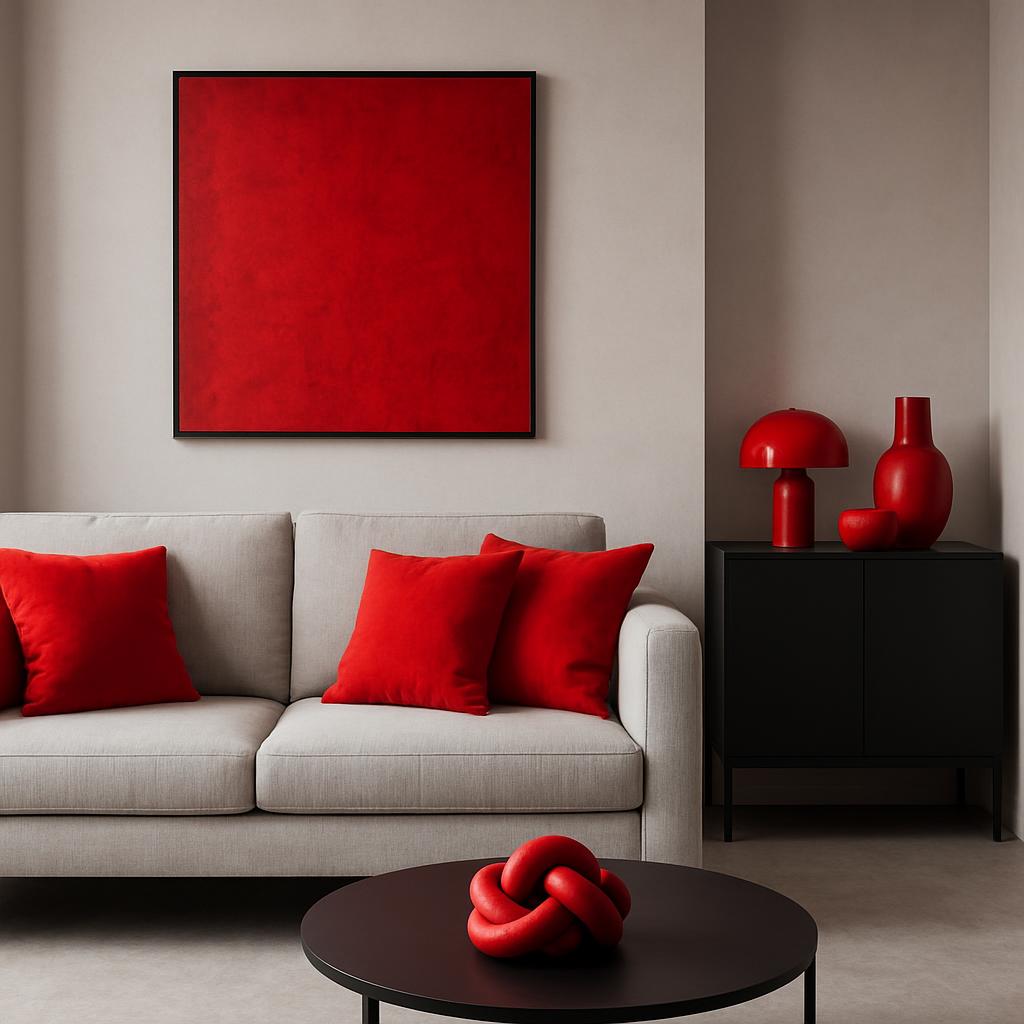
We can combine it with white, black, gray, gold, brown, and many more. It looks good on them. And RED also looks good on a space. Whether it's an apartment, an office, or a restaurant. It brings a smile to our face, steals warmth into our hearts.
It has many faces: sometimes infinitely elegant and sensual. Other times girlish and whimsical.
One thing is certain, though — it's NEVER boring!
Let's use it boldly. Apply it to walls, floors, choose red furniture, or even accessories. As curtains, upholstery, or just toss it on the sofa as a throw.
But let's keep two things in mind throughout!
MODERATION and HARMONY.
Pay attention to proportions, don't overdo it. And ALWAYS counterbalance with neutral colors so the overall effect is tasteful, not excessive!
Sometimes a small surface here and there is enough; other times we can be bolder. This can depend on the season, our state of mind, and our momentary mood.
Fortunately, today we can dispense with the old rule that red and its shades (purple, orange, pink) don't go together.
Let's boldly use combinations of the above, but pay attention to the shades!
When placing these colors next to each other in a space, it's very important to never choose matching colors from memory. Ideally, look at them together on site, or if that's not possible, try to bring a color sample with you, because the wrong shade can be fatal! Of course, "only" from an interior design perspective.
One more note about the first image of this post — I must mention the brilliant trick: if we can't tastefully hide something, then let's highlight it and make a design element out of it!
A perfect solution for this is to paint it bright red!